
Welcome back to Turntable Talk! This is our 27th round, believe it or not. By now all our regular readers know how this goes, but for any new readers, first off, welcome! I hope you find it interesting and check back from time to time here – new posts go up daily and we run the ‘Turntable Talk’ feature usually once a month. And second, briefly, on Turntable Talk we have a number of guest columnists from other music sites, sounding off on one particular topic. We have an index of past topics, with the final one of each in the link, others could be found going back day by day from each of those.
This month, our topic is a little different – Art Rock. No, we’re not digging into obscure rock that somehow seems a tad too experimental for the masses, but the actual art of music. In specific, album art and packaging. Of course, that was a bigger deal when vinyl ruled… that big 12” square canvas that was a record cover let a lot of imaginations and artistic talents run wild! It created an initial impact. Even the Grammy Awards noticed that; since 1959 they’ve given out an annual award for Best Album Cover or Recording Packaging. Frank Sinatra won the first one; since then The Beatles Revolver and Sgt. Pepper, Chicago’s X, Supertramp’s Breakfast in America, Linda Ronstadt’s Get Closer and the Rolling Stones Tattoo You are among the many winners. Thus, we’ve asked our contributors to highlight an album which had packaging they found exceptional.
Starting us off today we go across the ocean to Paul, from Once Upon a Time in the ’70s. Given his website’s focus, we’re figuring he’s not going to highlight Dua Lipa… but what record did jump out at him?
Well, it’s that time of the month again when Dave rounds up the troops for another Turntable Talk and this month we’re focusing on a different type of creative (unless your Joni Mitchell of course). This time it’s not about the music makers, it’s about the cats who put the art into artists.
I have a theory about record sleeves – you can appreciate and admire any album artwork but to genuinely love it you need to cherish the vinyl enveloped in that decorated cardboard.
For example, my favourite band is Steely Dan, no surprise there, but much of their artwork is pretty dreadful, something Messrs.’ Fagen and Becker readily admit to, although I do hold a special place for the artwork of 1980’s Gaucho.

The artwork for Gaucho was inspired by a mural created by Argentinian artist Israel Hoffman entitled “Guardia Vieja – Tango” (Old Guard – Tango). The original art is displayed on a public wall in a street museum known as Caminito in La Boca, a neighbourhood of Buenos Aires. I have so much love for this artwork (and album) that I bought myself a framed print of Hoffman’s original, which proudly hangs in our downstairs toilet, so every time I go to the loo, I come out whistling ‘Gaucho’ or ‘Hey Nineteen’.

On the flip side, whilst I’m no lover of prog rock and tracks that last for 20 minutes (unless it’s a Tom Moulton 70s disco mix!), I can still appreciate the creativity of a guy like Roger Dean and the fantasy landscapes he created for bands like Yes, Uriah Heep and Osibisa in the 70s.
Many of us had Roger Dean artwork plastered on our bedroom walls in the 70s (next to the tennis girl in the short skirt) even though we weren’t big fans of the music. Another Brit who shone in the world of album art was Storm Thorgerson, a giant within the industry and a splendid example of being in the right place at the right time. Not only was Storm a talented graphic designer, he also had the good fortune to hook up with a couple of college mates who would go on to form a little band in the 60s called Pink Floyd.
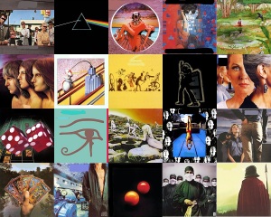
Along with partner Aubrey Powell, Thorgerson designed 20 album covers for Floyd including the iconic Dark Side of The Moon sleeve which propelled their design company, Hipgnosis into the limelight.
Constantly in demand, Hipgnosis created some of the most iconic album sleeves of the 70s for Led Zeppelin, 10cc, Genesis, T-Rex, ELP, Bad Company, Wings and Queen. Coming back to the task in hand, nominating a single album cover is indeed a tough gig.
For example, I love the early Roxy Music covers for their glamour, I’m also a huge fan of Neon Park’s distinctive artwork as displayed on Little Feat’s 70s albums and Joni Mitchell with her artistic eye and bold brush strokes knew how to turn out an original album cover.
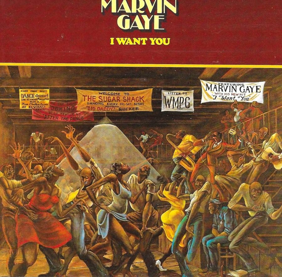
However when it comes down to it, there’s one album that for me ticks all the boxes – Marvin Gaye’s I Want You (as seen above).
In terms of boxes ticked, there’s several when it comes to this album.
Firstly, I love the artwork itself, so much so that my wife commissioned a painting of it for my 40th birthday and it has had pride of place in our home ever since.
Secondly, I love the album as much as I love the artwork and whilst it has never enjoyed the critical acclaim of ‘What’s Going On’ or ‘Let’s Get It On,’ it is my all-time favourite Marvin release.
Lastly and perhaps more importantly I have an emotional connection to this record. I purchased it on July 2nd, 1978, the same day I met my wife, and it became the soundtrack to our early relationship. The cover art for I Want You comes from an original 1971 painting by Ernie Barnes called “The Sugar Shack”.
When Gaye requested permission to use the painting, Barnes, who was a fan of Marvin’s, personally recreated it for the album by replacing some of the hometown references he’d included on the original painting with references relating to Gaye’s album.
The original 1971 “Sugar Shack” painting is now owned by Eddie Murphy who bought it for $50k from Marvin Gaye’s estate. A duplicate created by Barnes in 1976 recently sold at Christies for over $15 million so God knows how much Murphy’s original is worth now.
Noel Gallagher made the point recently that album artwork can be seen as being “the poor man’s art collection”, which kinda rings true…. unless you’re Eddie Murphy of course!

thanks for getting us going this time Paul! Good writeup. I’d never seen that Marvin album before, but it’s quite a cool painting & your personal relation to the record made it a great pick. I always quite liked the ‘Gaucho’ cover but never knew anything of its origins. And of course, Thorgerson was outstanding. I saw a movie about Hipgnosis last year, very interesting flick. He had a great sense of matching the image to music.
LikeLiked by 1 person
Cheers Dave and thank you again for hosting. Looking forward to reading the guys upcoming picks….
LikeLiked by 1 person
I was guessing you’d opt for either a Roxy Music one or a Steely Dan…I was close with SD at least. But your pick was great both artistically & with the album significance to you
LikeLiked by 1 person
Great pick Paul! I knew I heard of Ernie Barnes before…he did the paintings for a show called Good Times. I knew it looked just like that style and he was the one. I’ve always loved his paintings as they showed some on the show. Great album!
LikeLiked by 2 people
distinctive style, I can’t remember them in ‘Good Times’… did they have some up in the apartment?
LikeLiked by 1 person
Oh it was on the intro to Good Times…before the credit scenes I believe and the ending.
JJ was painting all of the time and they snuck some in then.
LikeLiked by 1 person
I’ll go look on YT…it does vaguely ring a bell.
LikeLiked by 1 person
Thanks Max, yeah we never had Good Times over here so ‘I Want You’ was my introduction to Ernie Barnes who was also an ex pro footballer so he had quite a life…
LikeLiked by 2 people
Great pick and one that didn’t even register on my list of possible picks. That said, I knew right away which cover art I wanted to cover, so didn’t bother giving it much additional thought.
I’m also intrigued “I Want You” is your favorite Marvin Gaye album. While I generally love the man, who in my book was one of the greatest soul vocalists, sadly, I do not know this album. I”ve pulled up the track list in Wikipedia, and I’m scratching my head. I don’t recognize even one song, at least based on the titles. Now you made me curious, so I have to check it out! 🙂
Last but not least, I’m impressed with the art work of album covers in your home. Peeing to the Dan sounds like a fabulous concept. And you get to go back, Paul, do it again! 🙂
LikeLiked by 3 people
Thank you Christian, looking forward to seeing your choice.
The title track to I Want You got a bit of airplay and was covered by Robert Palmer but I think this album was 4 years after ‘Lets Get It On’ and it was lost a bit in the disco boom of the mid-late 70s.
Thanks a lot, now I’ll be whistling Do It Again when I go for a pee from now on 😂
LikeLiked by 2 people
Crazy the amount of money a duplicate painting went for. Wow. Awesome backstory on album art.
LikeLiked by 2 people
That is… I mean basically for a print. I remember when Robert Bateman was really big in nature art in the 80s (he is Canadian so he seemed famous) and authorized signed , limited prints were about $500 and I thought that was outlandish for basically a poster.
LikeLiked by 1 person
Cheers Deke, yeah, Eddie Murphy is sitting on a fortune with the original painting, not that he needs the money!
LikeLiked by 2 people
That’s a great walk through some very cool album artwork. I had no idea that Marvin Gaye cover was from a painting. One could have guessed were I that astute as it was a very intricate picture.
LikeLiked by 2 people
Cheers Randy, looking forward to your piece….
LikeLiked by 2 people
It’s a point that’s been hammered to death, but vinyl records DID make a wonderful canvas for art. There’s always one that the music of the band on record might leave you cold but the artwork really to you on an artistic level.
LikeLiked by 2 people
For sure, I figure a good LP cover would add significantly to sales both because of subconscious thoughts (judging the book by the cover basically) and because record stores would feature the advertising banners, posters etc more; a bad cover might do the opposite.
LikeLiked by 1 person
Yeah, it was easy to be influenced by album art in the 70s when you had little idea about the music encased!
LikeLiked by 2 people
Not quite the case now with mp3s….sometimes I think part of the reason for a vinyl ‘comeback’ is people liking that big artwork to look at.
LikeLiked by 2 people