

Welcome back to Turntable Talk! This is our 27th round, believe it or not. By now all our regular readers know how this goes, but for any new readers, first off, welcome! I hope you find it interesting and check back from time to time here – new posts go up daily and we run the ‘Turntable Talk’ feature usually once a month. And second, briefly, on Turntable Talk we have a number of guest columnists from other music sites, sounding off on one particular topic. We have an index of past topics, with the final one of each in the link, others could be found going back day by day from each of those.
This month, our topic is a little different – Art Rock. No, we’re not digging into obscure rock that somehow seems a tad too experimental for the masses, but the actual art of music. In specific, album art and packaging. Of course, that was a bigger deal when vinyl ruled… that big 12” square canvas that was a record cover let a lot of imaginations and artistic talents run wild! It created an initial impact. Even the Grammy Awards noticed that; since 1959 they’ve given out an annual award for Best Album Cover or Recording Packaging. Frank Sinatra won the first one; since then The Beatles Revolver and Sgt. Pepper, Chicago’s X, Supertramp’s Breakfast in America, Linda Ronstadt’s Get Closer and the Rolling Stones Tattoo You are among the many winners. Thus, we’ve asked our contributors to highlight an album which had packaging they found exceptional.
Next up, today , from the Atlanta area and The Sound of One Hand Typing, we have John who no doubt has had two eyes looking for something to applaud here.
Our task this month was to comment on the visuals of music: a specific album cover that we consider outstanding, or aspects of the album jacket that are important to us. Having been a fan of the band Chicago since their first album, I immediately thought of the logo that has come to represent the band since their second album.
Chicago’s original name was The Chicago Transit Authority, and that was the name of their debut album. Soon after it was issued, the real Chicago Transit Authority, the public company that operates the buses and light rail inside the city, sued them, demanding that they change their name immediately, if not sooner. Deciding that the city of Chicago was too big to sue the band, they proclaimed in the liner notes for that first album that henceforth they would be known as Chicago.
Wikipedia tells us
Upon being renamed from Chicago Transit Authority to Chicago, the band sported a new logo. Its inspiration was found in the design of the Coca-Cola logo,in the attitude of the city of Chicago itself, and in the desire to visually transcend the individual identities of the band’s members. It was designed by the art director of Columbia/CBS Records, John Berg, with each album’s graphic art work being done by Nick Fasciano.Berg said, “The Chicago logo…was fashioned for me by Nick Fasciano from my sketch.”
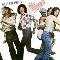
The logo has appeared on each album after the first one, and on advertisements, posters, and various of the band’s ephemera. On the album Hot Streets (also known as Chicago XII), for the first time the individual band members were shown on the cover, and the logo was reduced, but was still there (that was the first album after the tragic death of guitarist Terry Kath).
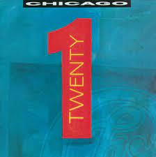
On the album Twenty1, the logo is there, but in the background.
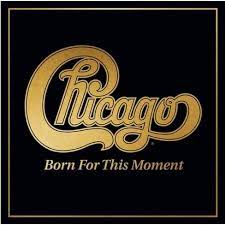
The band’s most recent album, Chicago XXXVIII: Born For This Moment, shows the logo in all its glory, in gold on a black background.
The point is, that logo on the outside is almost as important as the album on the inside. In a way, it’s like the slogan of another great Chicago product line, Zenith: “The Quality Goes In Before The Name Goes On.”

thanks John. Chicago and Kiss (who Deke looked at), they’re the two bands who managed to turn their actual name into a very recognizable logo. What a clever idea! Instant recognition! Chicago were great in the 70s both musically and visually finding different ways to use that same logo for different-looking covers. Someone in their ranks must have had a good grasp of advertising.
LikeLiked by 2 people
An iconic logo indeed! They were a powerhouse who delivered some classics over many years.
I have a friend who does backdrops for bands to hang behind them on stage. He has talked a lot about how honored he is to design backdrops with some truly great logos.
Nice pick, John!
LikeLiked by 2 people
I’m nowhere as big a fan of Kiss as Deke is but I have long admired their marketing and remember , maybe 25 years back, hearing Gene Simmons say ‘other guys have rock bands, but I have the first rock BRAND’. I thought he was onto something there
LikeLiked by 2 people
Well you didn’t have to look very hard to find a Chicago album in the store that’s for sure. A worthy choice for the topic John.
LikeLiked by 2 people
Wow, it never occurred to me the Chicago logo was inspired by Coca Cola. But once you compare the two logos, it’s so obvious!
LikeLiked by 1 person
how different it might have been if they’d preferred Pepsi!
LikeLiked by 1 person
Very true, likely way more ordinary!
LikeLiked by 1 person
It’s all about the logo thats for sure. Nice and big so back in the day you see Chicago albums from a mile away when you walk into a record shop. Cool post.
LikeLiked by 1 person
AC-DC, one more to go along with Chicago and Kiss in terms of having their name an instantly recognizable logo . Smart marketing
LikeLike
Yep, its all been said. As a logo big, bold, you know what you’re going to get. In retrospect I guess the band can thank the Chicago Transit Authority for spiking their wheels with the use of their name.
LikeLiked by 1 person
yeah that would have been clunky to keep.
LikeLiked by 1 person
Yep.
LikeLike
Great pick John…the logo IS very important. When I think of Chicago this logo comes into my mind…with the band or the city! I like the chocolate bar one the best.
I also thought it was smart not to show the band members at first… Supertramp did that as well…you never see the band age on their albums.
LikeLiked by 2 people
the logo is iconic. They were pretty clever with the first ten or so albums finding so many ways to use it and have the covers look different, yet the same sort of. I think my not emphasizing the guys in the band, it showed it was more about the music than the personalities. Besides with so many members, it might be hard for the casual fan to even keep straight who was who, so why bother?
LikeLike
Great choice, John. Branding and logos are important so people will recognize and remember who they belong to.
LikeLiked by 1 person
I once had a whole coffee table book of logos. I just liked looking through seeing various corporate logos from around the world. Some were amazingly creative.
LikeLiked by 1 person
Some logos are very creative, and I hope the creators get paid well.
LikeLiked by 1 person
Agreed.
LikeLiked by 1 person